
POSTER
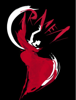
Carmen
I got to know Bizet's Carmen pretty well as a kid - one of my Dad's favourite operas, he would frequently blast it in our house on weekends. Many years later, I gave my parents 2 tickets to Carmen as a Christmas present and decided to make the poster artwork as part of the gift. The personal connection I have with this opera made it a very satisfying project. Since then, the artwork has also been used for the 2017 Santa Monica College production of Carmen .
Art Direction
What's in a name?
The central figure in Carmen is a confident, fiery young woman who holds a great deal of power over men - I wanted her name to appear around her, as though created by her movements, reflecting both her arrogance and the impact she had on the people around her.
Artwork
Sound & fury
The Carmen artwork had to carry a sense of drama, colour and movement, to reflect both Carmen's personality, but also the passionate, turbulent and ultimately tragic love affair between this free-spirited young woman and her hapless lover. I used ink on paper by splashing, moving the paper and then slicing into the shapes in Photoshop to create sharper edges. The images were comped together and colour adjusted to make the final artwork.


Artwork
Sharp & fluid
To reflect the action of the opera, I wanted the artwork to feel both flowing and full of life, yet simultaneously dangerous. I wanted the letters especially to feel sharp and pointed, to hint at the tragic ending of the opera.